Jeder Buchstabe ein Symbol der Teilhabe. Jede Zeile ein Zeichen unserer Gemeinschaft.

The handwriting of DZ BANK

Every letter, a symbol of participation. Each line, a reflection of our community.

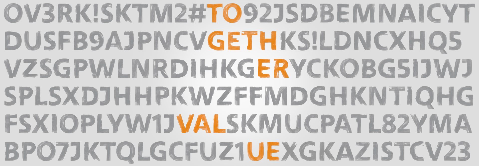
With the DZ BANK handwriting, we visualise the participation and contribution of each individual. Collectively as one. 
It’s an expression of the strength that forms when many individuals come together, and that’s what TOGETHER|VALUE stands for. We believe that the expertise of our employees is what drives the future success of DZ BANK.
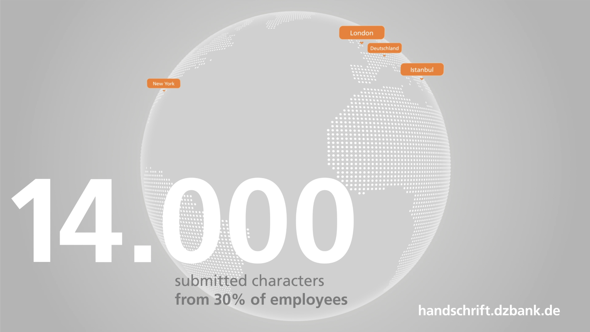
Das Bild stellt eine stilisierte Darstellung der Erdkugel dar, in der Städte mit orangefarbenen Markierungen hervorgehoben sind, nämlich "New York", "London", "Deutschland", und "Madrid". Es zeigt eine Zahl - "14.000" - die möglicherweise eine Statistik oder einen KPI (Key Performance Indicator) darstellt, begleitet von einem Text, der Hinweise geben könnte über die Beteiligung oder den Input von Mitarbeitenden: "eingereichte Zeichen von 30% der Mitarbeitenden". Dies deutet darauf hin, dass 14.000 Zeichen von 30% der Mitarbeitenden eingereicht worden sind, möglicherweise für ein Projekt oder eine Initiative, die geografisch weitreichend ist oder globales Engagement hervorhebt.

Whether in New York or Hong Kong. Mumbai or Münster. Our expertise extends beyond national borders. We rely on numerous employees in the most important global markets who work together. Thanks to an online platform, each of them, wherever they are in the world, has had the opportunity to participate in shaping our handwriting. Because, as DZ BANK itself, our typeface should know no boundaries. Together, we have achieved this goal. All of DZ BANK’s national and international locations participated, and 30% of all employees contributed. That’s how we collected 14,000 characters, which now form the strong foundation of our shared handwriting.

A collective achievement: the DZ BANK handwriting

After all the preparation and extensive involvement in the project, the time has come: 
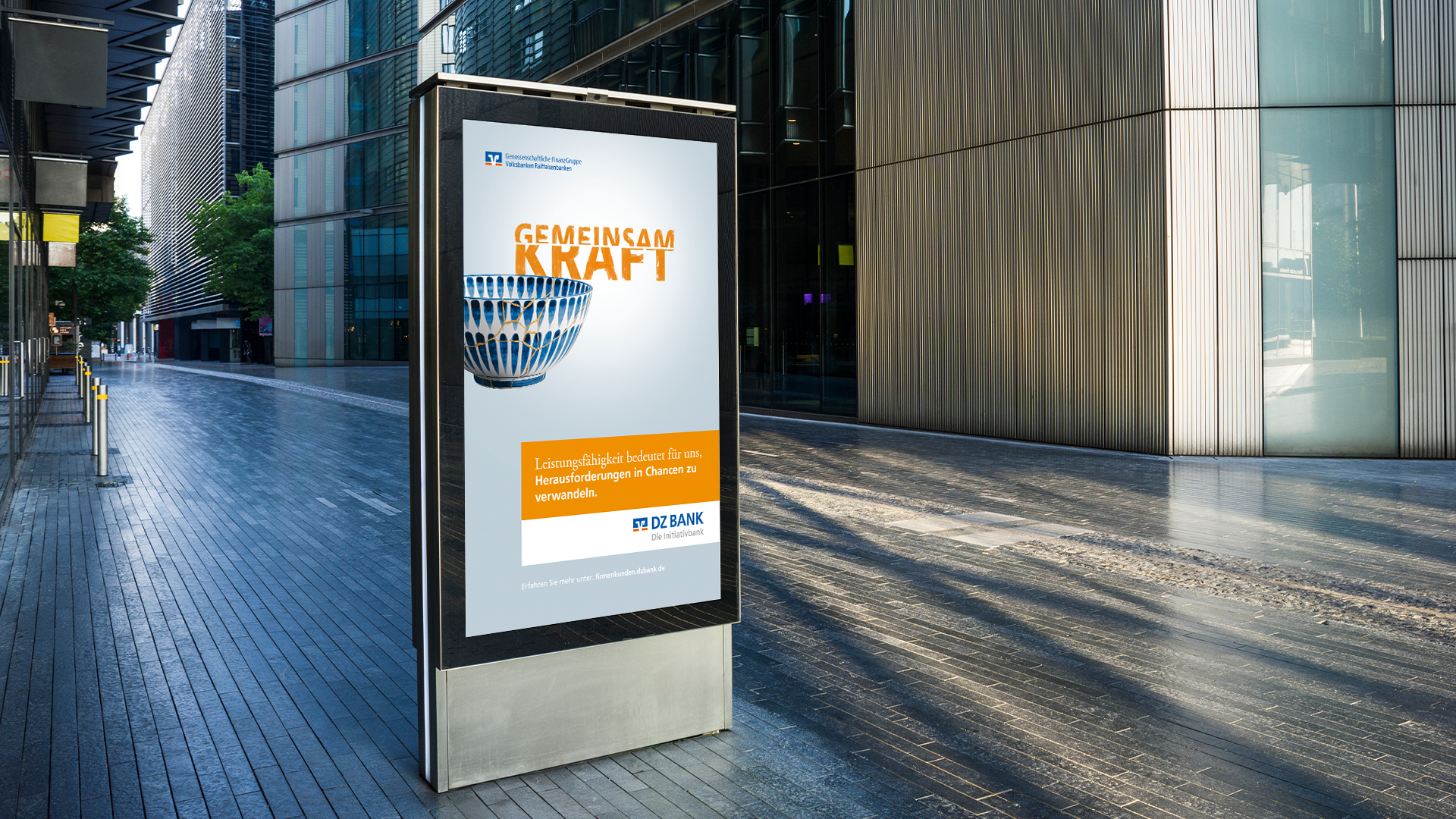
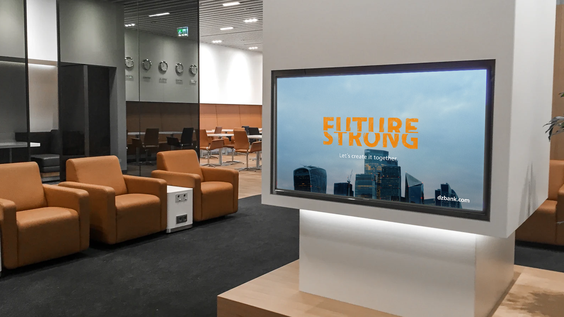
The DZ BANK typeface is complete and is gradually being incorporated into our brand communication – in ads, at events, on the web and on billboards. As a powerful symbol, expressing the values of DZ BANK in a special way, wherever we want to communicate them in the future. 

Connecting the individual to the big picture

Zeitraffer vom typografischen Entstehungsprozess der Schrift

To give the final form to a typeface that was co-designed by people all over the world? That was a very special experience.

Henning Skibbe, type designer

The DZ BANK handwriting style was created by people for people. Therefore, it was clear to us that for the final step of combining the individual handwriting styles, we would also rely on human expertise. Henning Skibbe has this expertise.
As an experienced type designer, he and his team combined the individual characters, layered them on top of each other, and meticulously worked out the special features that make real handwriting unique. 
The result was a typeface that doesn’t simply represent the norm, but has its own rough edges. That’s what gives the DZ BANK handwriting its individual character.

Whether in ads, at events on the web or on billboards.

In the future, our handwriting will be visible wherever we showcase the values of DZ BANK.

The image shows a person's hands typing on a laptop keyboard. The laptop is placed on a white desk. Next to the laptop is a binder titled "Finanzwesen" which suggests it could contain financial or business-related information or documents. The room is lit with natural sunlight, as evident from the shadow and sunlight reflections on the desk. There appears to be some greenery, likely from houseplants, in the background contributing to a bright and refreshing workspace atmosphere.
The image shows a sleek urban setting with tall modern buildings lining a pedestrian pathway. In the foreground, there is a large advertising billboard displaying promotional content. 

**Details of the Image:**

1. **Billboard Advertisement**:
   - **Text**: The advertisement prominently features the words "GEMEINSAM KRAFT," which translates to "TOGETHER POWER" in English.
   - **Graphics**: Beneath the text is an image of a globe, symbolizing unity and collaboration.
   - **Additional Text**: Underneath the main message, there’s more text in a white box on an orange background containing details or a slogan, likely promoting a message of strength or unity.
   - **Logo or Branding**: There are logos or indicators of a company or organization at the top and bottom of the ad.

2. **Setting**:
   - **Architecture**: Modern design with glass facades and clean lines.
   - **Lighting**: It appears to be daytime, creating a reflective environment with shadows suggesting sunshine.
 
3. **Color Scheme**:
   - **Prominent Colors**: Orange and white, possibly chosen for their eye-catching and positive significance.
   - **Background**: Earthy and metallic tones in the architectural surroundings, complementing the advertisement's bright colors.

This scene likely represents a message or campaign encouraging strength, cooperation, or community among people, organizations, or nations.
The image depicts a sleek and modern corporate office environment. Here's a breakdown of what's in the image:

1. **Office Space:**
   - The image shows a modern office or business lounge area that has a professional and clean aesthetic.
   - There are glass partitions that separate different sections of the office.

2. **Furnishings:**
   - There are comfortable tan leather armchairs arranged on a black carpeted section of the floor, suggesting a waiting or relaxation area.
   - It's likely that this arrangement is aimed at providing comfort to visitors or employees.

3. **Television Monitor:**
   - A large monitor is prominently displayed on a white stand.
   - The screen displays the words "FUTURE STRONG" in bright orange lettering.
   - The background of the text is a city skyline, highlighting modern urban architecture.

4. **General Atmosphere:**
   - The image portrays a modern business environment that focuses on technology and a forward-thinking mentality.
   - The slogan "FUTURE STRONG" suggests a company or brand with an emphasis on progress, innovation, and resilience.

5. **Ambient Lighting:**
   - The lighting appears to be well-designed, likely using overhead lights that contribute to the professional feel of the space.

6. **Additional Details:**
   - In the background, there's a glimpse of an office setup with desks and chairs, indicating a workspace.
   - A few decorations or details on the walls observe the brand aesthetics or personal touches which give this space a polished and refined appearance. 

Overall, the image represents a modern, professional, and inviting office environment, showcasing comfort, design, and a strong emphasis on future-forward thinking. 

---